Learning Activity – Analysing the use of design and fundamentals

Skjermbilde 2015-01-12 kl. 10.43.05

Blowing_Bubbles_by_AquaSixio

Nr 1:
The first thing i really like about the illustration is the idea and concept. The artist Cyril Rolando other known as AquaSixio online stated this with the illustration:
Blowing bubbles

Too much water,
But you can’t stop the flow,
Getting absorbed in your work.

Too many desires,
But you can’t stop the walk,
Flooded by the law and order.

Sometimes, you feel like a goldfish,
Blowing bubbles in a tiny bowl,
But you can’t stop. Dream on.

He has camptured the moment pretty good in this illustration, it’s realxing to look at with the calm athmosphere with the hair floating, the gold fishes swimming around, pages floating and bubbles going up to the surface. The persons facial expression is also a big key to the athmosphere and the general aspect of the illustration itself.
He have done a great job with the coloring by making everything look like it’s under water and the general feeling with the blue, green, yellow touch and to have the goldfishes as a contrast with red, orange and yellow.
The depth in this picture is pretty good even though he didnt put a lot of objects in the background. You can see one stack of books behind the person which gives it a sense of depth, but if you start to look more closely you can see bubbles, pages and fishes that helps to create more depth in it.
I also like that when you look at the illustration you see the persons face at once and then you look around and find more and more small details that the artist have put in.
Nr 2:
The style could look almost like it was painted on canvas, but it is digitally drawn in photoshop with a wacom tablet. The artist wants to show emotional aspects and tell you something rather than only show you pixels or beautiful things. Here is a quote from him: I’m aware my works don’t come within the scope of a high artistic richness. I don’t want to do beautiful things, but bringing out the difficulty to catch the emotional aspect in tiny, frozen, flat colored rectangles. Overall, I want to ” tell something “, not only ” show pixels «.
The style he uses in this and other illustrations is a great choice. The illustrations dosent look complete, sharp if you ocmpare it to other digital illustrations and it’s a bit rough like a painting. It makes the illustrations have a more natural feeling and you can experince the feeling but also see the message, idea and concept of the illustration.
 
Nr:3
I think it floats between both expressions of beauty and self. The artist dosent make any personal illustrations thowards himself but more of his ideas, aspects and how he sees or interpret diffrent dark topics of the world.
Nr: 4
The first thing i would have though of with this illustration is how to execute the expression correctly and look up how other artists have created calm and dreamy athmospheres. I would have done some research on both idea, symbolism and general feelings.
Nr: 5
I would have gone with most of the same colors. Blue and green as the base and heaviest colors at first then added a soft yellow for higlights, but not too much since it’s supposed to be under water. I would maybe have used a bit stronger colors on the fishes just to make them pop more and after everything was finnished coloring i would have put one last layer with a overall blue-green-ish tone so the yellow highlights would look more natural.
Nr: 6
Personally i would make it more simple but with the same amount of details. I would make it a bit more cartoon-ish so it would look more playful since it has more ‘’dark’’ message.
Nr: 7
with composition i would create a calm and floating feeling with using the pages, bubbles, fishes and a bit more of the hair to create the floating feeling.
The artist actually made a second version of that illustration where you can see the growth of his color and depth use. The first illustration with the gold fishes were made back in 2009 as where the new one is made early in 2014.
all_my_studies_by_aquasixio-d76knmd
For more info about the artist and to see more of his work follow the links under:

http://aquasixio.deviantart.com

http://sixinside.com/about/

http://aquasixio.deviantart.com/art/Blowing-Bubbles-142162618

http://aquasixio.deviantart.com/art/All-my-studies-434304661

Learning Activity – Starting Phase of Designing Visual Identity

Learning Activity – Starting Phase of Designing Visual Identity

Watch the Lynda course for Design Techniques in Photoshop and Illustrator by Deke McClelland and do the final assignment:

Starting phase of designing visual identity (1,5 days)
Design a logo for the following service and according to the following brief:

  • The product/service name: Chemin
  • The product/service description: A new urban railway service that takes passengers from the airport to four major centres in the capital of the country. The service will expand in due time to cover wider areas and to extend to other cities in the country as well.
  • Unique aspects of the product/service: The service prides itself in using the latest new-millennium technology, thus being sophisticated, super-fast, convenient and comfortable BUT NOT expensive and overly luxurious.


chemin

Print


Learning Activity – the Components of Visual Identity

Learning Activity – the Components of Visual Identity


1. Name the three most important components of visual identity.

– Logo, farge og typografi

2. Describe the difference between logotype and signature.

– Logotype er navn, slogan, farge, typografi, identifisering og budskap mens sinature er logoen i sin helhet med både tekst, bilde etc.

  1. Using Kuler create a colour scheme (using only three colours in each set) for the following products

    – A rich chocolate cake that is made from real chocolate. The keyword here is “quality”.
    Chocolate
    – A courier company that delivers internationally by air, land and sea – their main focus is fast delivery.
    Airline
    – An international insurance company that focuses on family values.
    forsikring


  1. Write your name in four different typefaces, according to the following criteria. Use a typeface that:
    1. expresses a unique quality about you
      tegning
    2. is inspired by your favourite food
      food
    3. makes your name look sophisticated
      sofisikert
    4. is drawn by hand
      hand


Learning Activity – A Knack for Names

Learning Activity – A Knack for Names

 
Consider the tips on Inspiration given in your prescribed book and create a name for an ice cream. The ice cream has a range of different flavours, but the unique aspect it should communicate is the fact that it is the coldest ice cream in existence. Now come up with five name options for this product (you should not spend more than a few minutes on each name) using inspiration from:

  1. Latin – Frigidus
  2. Colours – Blizzard
  3. Metaphors – Glacier
  4. Science – Zero Kelvin
  5. Myths – Jotun

Learning Activity – Planning a Fashion Shoot

Denne ukens learning activity så skulle vi planlegge en photoshoot med temaet snøhvit. Vi valgte å fokusere på dronningen og det røde eplet.
Moodboard:


Her er noen av bildene som vi tok, uredigerte:

IMG_2517 IMG_2541 IMG_2547 IMG_2550 IMG_2552


Valgte å redigere på dette bildet. Har ikke retusjert bilder så mye før, men var ganske gøy å holde på med.


IMG_2517_edited

Learning Activity – Graphic Design History.

Learning Activity – Graphic Design History

Question 1
Practical assignment (observation and analysis)            1 days
1.1.Define, in your own words, the Bauhaus, De Stijl and Swiss
Movements.
1.2. For each of these movements: find examples from their eras,
as well as current designs that are influenced by these styles.
Explain in your own words how these designs were inspired by
the movements.
Question 2
Research, written & practical assignment (problem solving)    1,5 days
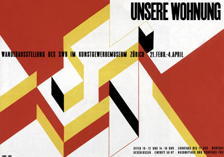
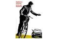
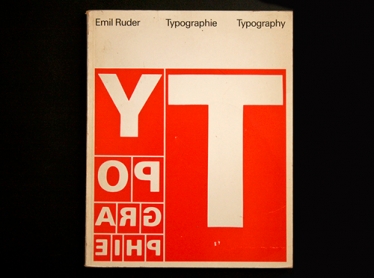
  • Look at the history timeline at the beginning of this lesson. Gather information from 1900 – 2000, and design your own timeline for the Swiss Design Style. Each movement should be described in a creative way.


SWISS DESIGN

Swiss design som kom fra nederland 1940-50.
Ledet av Josef Müller-Brockmann far Zurich School of Arts and Crafts go Armin Hofmann fra Basel School of Design.
Kjennetegn: Internasjonal stil. Enkelhet, lett å lese, San serif, grid og asymetri.
Kombinasjon av tekst og foto. Plakater var på denne tiden sett på som den mest effektive formen for kommunikasjon.
Designere fra perioden: Max Bill, Armin Hofmann, Josef Müller-Brockmann, Emil Ruder

Her er noen eksempler på swiss design:
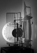
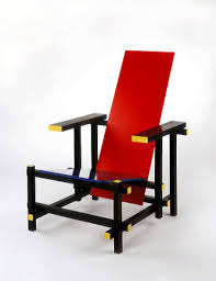
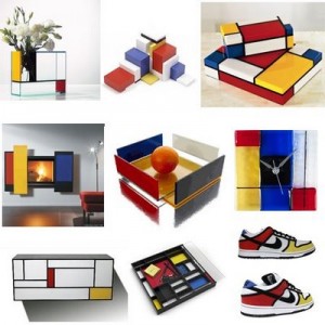
maxbill3poster  History Poster 7  loose 2


images-2   emilruder_typography-374x279


7bee932ec97edd1143db23db00f250fb

Swiss-timeline1-1900-2000


DE STILJ
De Stilj var en bevegelse etablert i 1917 av Theo van Doesburg, Piet Mondrian og Gerret Reitveld.
Ideen var enkelhet, abstraksjon og reduksjon. Forenkling av komposisjon rene geometriske former og primærfarger.
De Stilj var også navn på et magasin om deres teorier ledet av van Doesburg. Magasinet representerte det mest viktige arbeidet til bevegelsen.
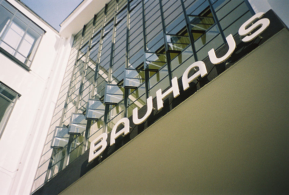
images-1    mondrianganged1-300x300


THE BAUHAUS
The Bauhaus er en kunstskole som ble grunnlagt i 1919 av Walter Gropius i Weimar, Tyskland.
De flyttet til Dassau i 1924, og stengte dørene i 1933 under press far Nazi politiske parti.
Laszlo Moholy-Nagyand og Hagbart Bayer bidro til opprettelsen av grafisk design via Bauhaus. Eksempel: Hovedrolle i utviklingen av san serif typografi.

87144fda8052b04cbb1c89de30443c77d70102    284835.501
1bauhausbuch_1_1   3 lichtmodulator_0  Unknown-1

239px-ABayer  bauhaus_moma_09_17  2 304_einband_bauhaus_1923_0

Unknown  250px-Jfader_barca_pavillion